Have you ever looked at your GPS screen and thought, “Those tiny symbols all look the same!”
While we might be older, many of us retirees enjoy doing things like traveling, hiking, RVing, geocaching, or boating. For me, I struggle to see or recognize the default GPS symbols quickly while checking out my GPS devices. With that in mind, you can easily create your own custom GPS symbols that are bigger, clearer, and easier on older eyes. The best news is, you don’t need to be a professional graphic designer to do it.
I don’t know about you, but I couldn’t wait to change my Garmin GPSMap 64 and BaseCamp Application with some custom graphics I made specifically for my GPS needs. I’ll walk you through this step by step, just like I would if we were sitting at the same table with a cup of coffee and a laptop.
Why Custom GPS Symbols Are a Game-Changer for Seniors
As a graphic designer, good graphic design is about clarity, not decoration. That matters even more as we get older. Here’s why seniors love to create custom GPS symbols:
- Easier to see in bright sunlight.
- Clear shapes instead of confusing tiny icons.
- Personal meaning. (your symbol designs make sense to you)
- Less eye strain and frustration.
- Faster recognition while driving or walking.
If you use a GPS device from a company like Garmin, this can make a huge difference in your day-to-day GPS use, whether it’s a handheld unit like the Garmin GPSMap H1 or a navigation unit like the Garmin DriveSmart 86 for your car or truck.
The 30 Day Emergency Prepping Plan for Seniors: A Friendly Guide.
What Does “Create Custom GPS Symbols” Really Mean?
In simple terms, it means designing your own small picture (icon) that adds custom symbols to your standard GPS symbols library.
These symbols are used for:
- Waypoints (favorite restaurants, campgrounds, parking)
- Points of interest
- Personal landmarks (home, doctor, friends’ houses)
- Instead of a tiny generic dot, you might use:
- A bold letter
- A simple shape
- A high-contrast image
Can I Replace The Garmin Default Symbols?
The short answer is “NO!” These are embedded in the devices firmware. Garmin deliberately protects default symbols so users can’t break core UI behavior. If you do jail-break it, firmware updates, restarts, or symbol refreshes will restore Garmin’s originals. You can add custom GPS symbols and change these whenever you want.
Where Can I Use My Custom GPS Symbols?
For the purpose of this article, I’ll be writing about Garmin devices and the BaseCamp application specifically. If you use a different manufacturer’s device or software, you will have to look that up. I imagine it is similar to this.
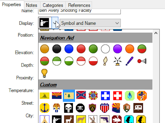
First thing to talk about is I use is Garmin’s BaseCamp software. You can use this application to manage your Garmin devices. I use it to add waypoints or points of interest to my GPS map. It also allows me to set up different “collections” in order to segregate my maps by type or purpose and I can also add notes and web links to my waypoints. Once I’m done, I sync BaseCamp to both of my GPS devices.

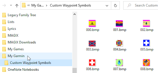
For BaseCamp you can have up to 64 custom symbols. Starting with 000.bmp and ending at 063.bmp. The path for this is:
C:\Documents\My Garmin\Custom Waypoint Symbols

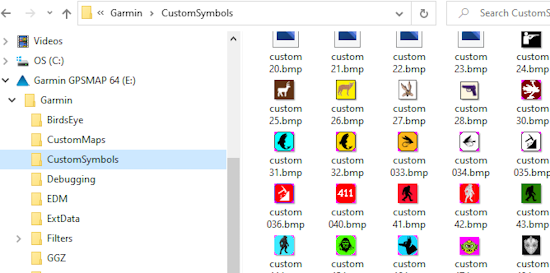
When using a Gramin device, the newer models can support up to 56 custom symbols starting with custom 0.bmp and ending at custom 55.bmp. Be aware that on some older legacy Garmin devices, you could be limited to 24 custom symbols.
Keep in mind, having 64 custom graphics on BaseCamp doesn’t mean they will all copy over to your Garmin’s device due to its 56 custom graphic limit. That’s 8 too many and anything past custom 55.bmp will not display.
The Golden Rules Of Designing Custom GPS Symbols
Before we jump into tools and design, let me share what works best for older eyes.
1. Keep It Simple
- One main shape
- No tiny details
Think “road sign,” designs. You’re not creating an “art gallery” of icons
2. Use High Contrast
- Black on white
- Yellow on dark blue
- Avoid pale colors and pastels
3. Go Bigger (When Possible)
- Chunky lines
- Thick borders
- Strong shapes
These design choices are the how and why that will make you successful when you create your custom GPS symbols.
Custom GPS Symbols Tools That Are Easy To Use (No Design Degree Required)
You do not need expensive software. Here are some Beginner-Friendly Options for you to pick from:
- Paint.NET – Simple and familiar. This is my preferred graphic application. And it’s FREE. I also recommend you download the plug-ins for it. These are free too.
- GIMP (free, powerful)
- Paint (Windows) – Simple and familiar
- Preview (Mac) – Surprisingly capable
- Canva – Drag-and-drop, very senior-friendly
Keep it easy, use what you know and keep it simple. You can always improve later.
Step-by-Step: How to Create Custom GPS Symbols
Here’s the scoop. If you want to make your own custom GPS symbols, then follow the easy steps outlined below:
Step 1: Decide What the Symbol Is For. Ask yourself:
- Is this for parking?
- Camping?
- Medical locations?
- Favorite restaurants?
Remember having a clear purpose will equal a better design.
Step 2: Create a Small Square Image
Most GPS units prefer:
- 16×16, 24×24, or even as large as 32×32 pixels. All of mine are 24×24 pixels
- Square or a round shape shape
- Simple colors
- If you want transparent edges, you must use the magenta color. The RGB color code for that is 255,0,255 or hex color code is: ff00ff
Tip: Design it larger first, then re-size and shrink it down to 16×16, 24×24 or 32×32 pixels.
Step 3: Use Bold Shapes or Letters
I suggest looking for nice simple vector type images. Examples that work well:
- A big “P” for parking
- A solid triangle for hiking spots
- A house outline for homes
Remember: recognition beats decoration or a complicated design. Your graphic should be bold with a easy colored background at its final size that makes it “pop” and stand out at a glance. If you look at several of my icons, you’ll notice the same image repeated twice. The yellow background means I have not been there, and the green background means I have visited that spot.
As you can see, I have custom GPS symbols for fishing, trout fishing, bigfoot, and dogman encounters

Step 4: Save in the Correct Format
It’s pretty simple. All you have to do is follow three basic rules. Garmin GPS devices use:
- BMP (bitmap) file format
- 8-bit or 256 colors
- Save the size at 16×16, 24×24, or 32×32.
It’s that easy! This step matters—wrong formats won’t show up.
Step 5: Upload to Your GPS

All you have to do to upload these is:
- Plug your GPS into your computer. Open up your file manager and browse to your Garmin device.
- Open the Garmin folder
- Drop the custom 0.bmp to custom 55.bmp file(s) into the CustomSymbols folder
How hard is that? Once you upload your custom GPS symbols, you can select any one of them just like any built-in symbol.
Common Mistakes Designing Custom GPS Symbols And How to Avoid Them
If things are going wrong for you, here’s why:
❌ Tiny details
❌ Fancy fonts
❌ Low contrast colors
❌ Trying to replace built-in symbols
Instead:
✔ Think bold
✔ Think readable
✔ Think practical
That’s how you successfully create custom GPS symbols that actually help.
Final Thoughts On Custom GPS Symbols: You’ve Got This
Creating your own GPS symbols isn’t about being “techy.” It’s about making technology work for you, not the other way around. So take it slow. Keep your designs simple and focus on visibility. You can’t go wrong, and you can confidently create custom GPS symbols that make traveling easier, safer, and more enjoyable—at any age.
Want more practical, experience-backed articles like this? Subscribe to our newsletter today and get expert senior-focused tips, strategies, website updates, and announcements delivered straight to your inbox.

